How does income affect admission at elite schools?
Raj Chetty, David Deming, and John Friedman have written a paper that provides new and rigorously supported answers to the most important questions about college admission. It’s great stuff — as valuable in forming an accurate picture of admission as Peter Arcidiacono’s work with the data pried out of Harvard and UNC during the Students for Fair Admissions (SFFA) litigation.
Chetty and his coauthors managed to get their hands on application and admission data for 2.4 million applicants, including from selective colleges, which don’t like to hand it out.
“Within this dataset, we focus on the 12 Ivy-Plus colleges, 12 other highly selective private colleges (e.g., Northwestern University and Washington University), and 9 highly selective state flagship public institutions (e.g., University of California Berkeley and University of Michigan Ann Arbor).”
There are too many gems for me to examine them all in one post. I’m going to look at one topic at a time and write maybe five posts. Maybe more. I’ll focus on the questions most relevant to you as parents thinking about admission, not as taxpayers or citizens concerned with equality.
Today we’ll consider this question: how does parents’ income affect admission to elite private colleges? By elite private colleges, Chetty and coauthors mean the eight Ivy League colleges, Chicago, Duke, MIT, and Stanford.
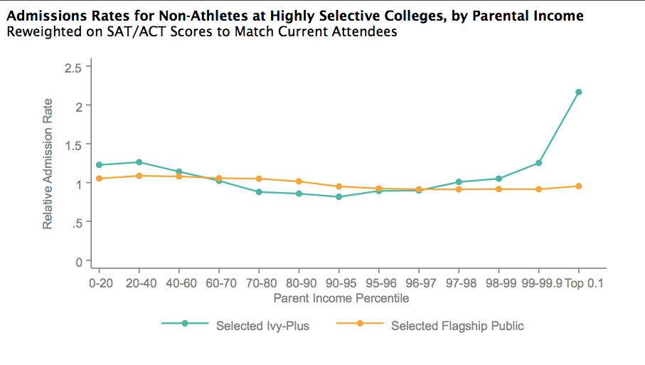
The authors are controlling (kind of) for test scores here, so we’re (mostly) comparing apples to apples across the income distribution. Let’s read from left to right.
Poor kids get a boost
Applicants whose parents have incomes below the 40th percentile have better odds of admission than those from all but the richest families, this paper finds. The difference here, about 1.25 the average admission rate, surprises me.
Arcidiacono’s analysis of Harvard data as an expert witness in the SFFA lawsuit shows a decent but not huge admission boost for poor kids. His preferred model has several dozen variables, so I’m not going to put an unwieldy table in here. Here are his coefficients for a handful of variables, to give a sense of the relative effect sizes. Remember that these coefficients show the marginal effect of just that one variable on the odds of getting in.
African-American: 3.596
Dean’s interest list (for donors’ relatives): 3.301
Faculty or staff child: 2.472
Legacy: 2.141
Hispanic: 1.908
Disadvantaged: 1.640
Early action: 1.480
It’s a bit more of a boost than applying early action and about half the effect of being related to a big donor.
How closely does the Harvard “disadvantaged” flag align with being in the 40th percentile for income or below? Since Harvard is need-blind, its admission office doesn’t see financial aid information. It kind of squints at each kid’s file and labels some “disadvantaged” if they seem poor. I’m going to roll with it because Harvard doesn’t have any income cutoff for that “disadvantaged” flag.
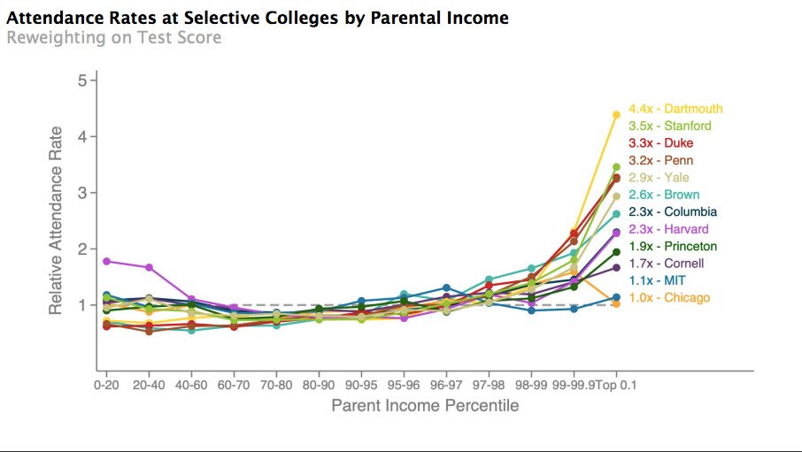
Again from Chetty, it looks like Harvard is most generous among its peers in admitting poor kids. Look at the purple dots on the left side of this chart. Admittedly, this chart shows attendance rather than admission rates, but it’s the best we can do.
So we know from Arcidiacono that Harvard gives a moderate boost to poor kids, and we know from that Chetty chart just above that the rest of the super-selective places are probably less generous. What else might explain the higher admission rates for poor, smart kids?
Levels! The admission rate is good to know, but we also need to think about how many kids fall in that sub-40th percentile bucket. The answer is not many: Chetty’s appendix says that kids from those poor backgrounds make up just 8 percent of the Ivy-Plus colleges’ student bodies.
It would also be informative to see this chart again once colleges end affirmative action, since income and race are correlated. Also, strange things just happen with small sample sizes.
A big middle-class swath faces tougher competition
Kids from households between the 40th and 99th percentiles for income have lower rates of admission at the most selective schools in the country. This is a big group, with household incomes between $55k and $570k.
Why the difference?
Markets clear
Supply of these kids is vast. There are thousands and thousands of kids from this income group applying. Demand is smaller at these most competitive schools. These very competitive colleges want lots of kids in this income bracket for their academic and other talents (this income bracket includes most people in the US, after all!) and because many of their parents can pay full tuition. But these applicants don’t offer the same opportunities for good PR as poor kids, and their parents are less likely to fund a new library than the one-percenters. The admission rate that arises clears the market.
Geographic competition
When your kid applies to college, he won’t compete with every other applicant but rather within overlapping, narrower pools. For example, your child might be competing with other kids from the Bay Area, likely physics majors, oboe players, etc.
I expect part of the tougher competition is because wealthier families are likelier to live in SuperZips, giving rise to more competitive geographic admission pools. Children from those families are competing with lots of other smart kids from Westchester, McLean, etc., which drives down the admission rate for that greater middle-class stretch.
This is alarming stuff, but don’t panic!
Levels, again
The competition is tougher for more affluent kids, but many, many more of them go to these schools. Kids from families between the 40th and 99th percentiles for income account for 76 percent of the student bodies of these Ivy-Plus colleges.
Many other colleges want your kid and money
Chetty et al. define Ivy-Plus as the eight Ivy League colleges, Chicago, Duke, MIT, and Stanford. This is the nosebleed section of the rankings. Look just below on the rankings, and there are lots of prestigious colleges happy to take students with high test scores and parents who can pay full tuition. Please don’t draw conclusions about all colleges from data about these few.
Notably:
That’s how we want that line to look for public colleges: nice and flat. The story for out-of-state applicants to public colleges is a little more complicated; we’ll examine in an upcoming post.
Now let’s look at that part of our main chart that goes way up and to the right. 📈
The super-rich have it good
This part of the chart is depressing. The children of families with incomes over $570k get in at higher rates, controlling for test scores.
One of the reasons why is obvious. These are the people who make big donations, like Ken Griffin did. Here’s an email from the dean of Harvard’s Kennedy School to Harvard’s dean of admission in June 2013:
“Once again you have done wonders. I am simply thrilled about all the folks you were able to admit…Those are big wins, all big wins, and [redacted] has already committed to a building, and other names have committed major money for fellowships.”
What building was promised, we wonder?
Apropos of nothing: Idan Ofer, a billionaire, started making “generous” donations in 2013, including a building for the Kennedy School. His son, Gil Ofer, graduated from Harvard in 2017 – four years after the Kennedy School dean sent the email, and four years after the donations started.
Two other reasons, which we’ll examine in detail in future posts, are feeder schools and the “right” extracurriculars. Rich families can’t make much of a difference in their kids’ test scores and the academic ratings that colleges consequently assign. But they can figure out which extracurriculars are admission-optimizing and then make sure their kids found the right kind of NGO.
You can give your kid a fairer chance by taking my online class on extracurriculars. Super-rich families use their connections to get the inside scoop, but I’ve gotten it too. Harvard tried to keep a lot of internal documents produced in the lawsuit under seal, but I found them online. I’ve read hundreds of pages of academic studies and firsthand accounts by admission officers. All of that information is distilled into actionable steps in that online class.
I’ll be back with more lessons from this paper next week.


